YourShare
Share the costs,
without creating IOU's
Why design it?
My Hypothesis
Gaps currently exist in allowing people to split a cost for certain purchases or bills without creating informal debt and having to "figure out" the cost per person after the fact. An app which allows groups to evenly and simply split finances so that no single perso's bank account is relied on would be beneficial.
My workflow
A snapshot of my design process.
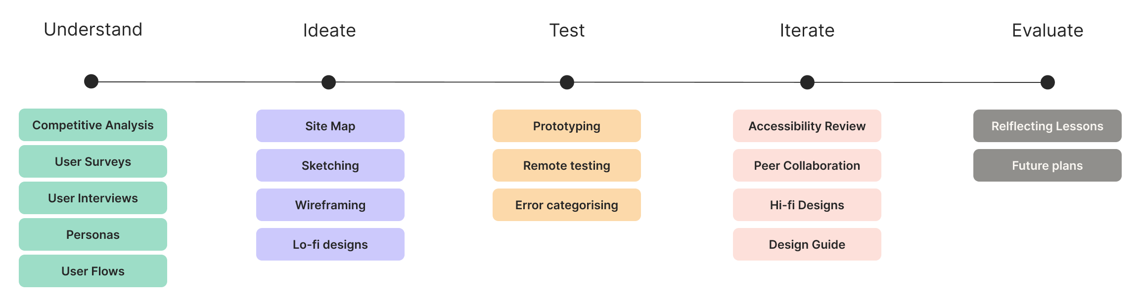
Understand
Surveys
After some competitive analysis of SplitWise and SettleUp I surveyed 20 people who currently split costs with others. The idea was that this would help me structure my user interviews. The results were:
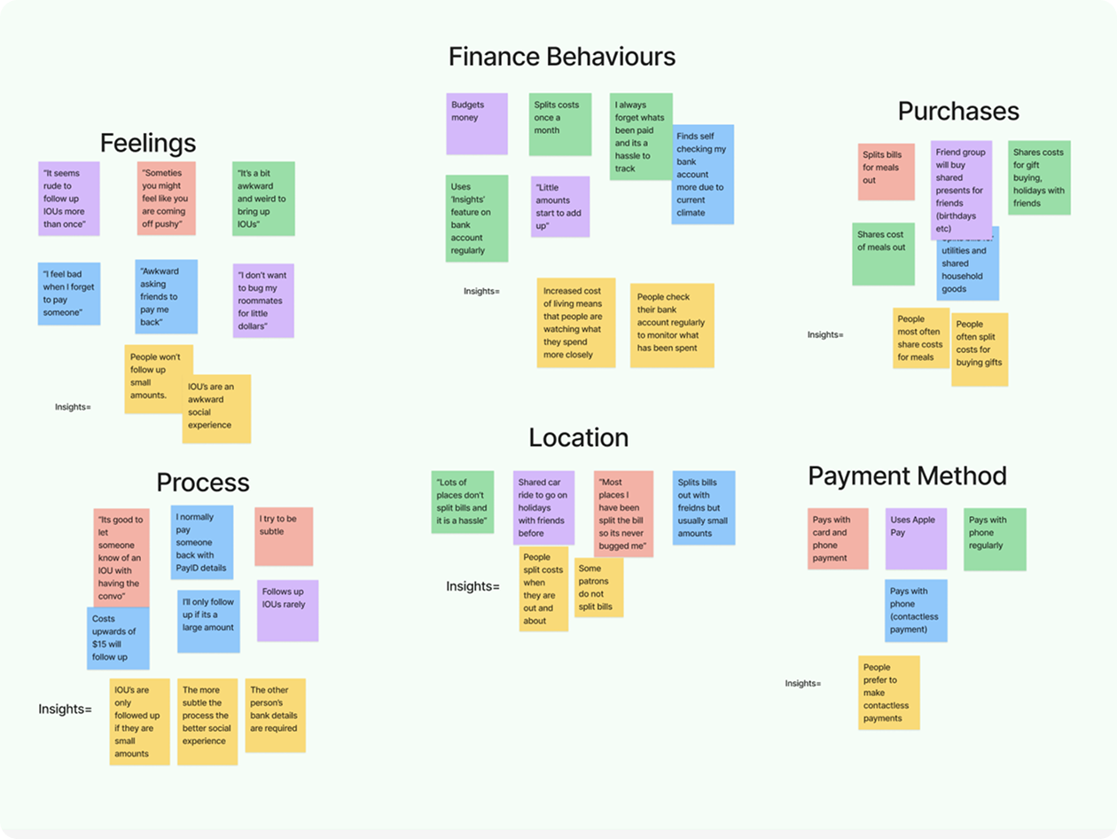
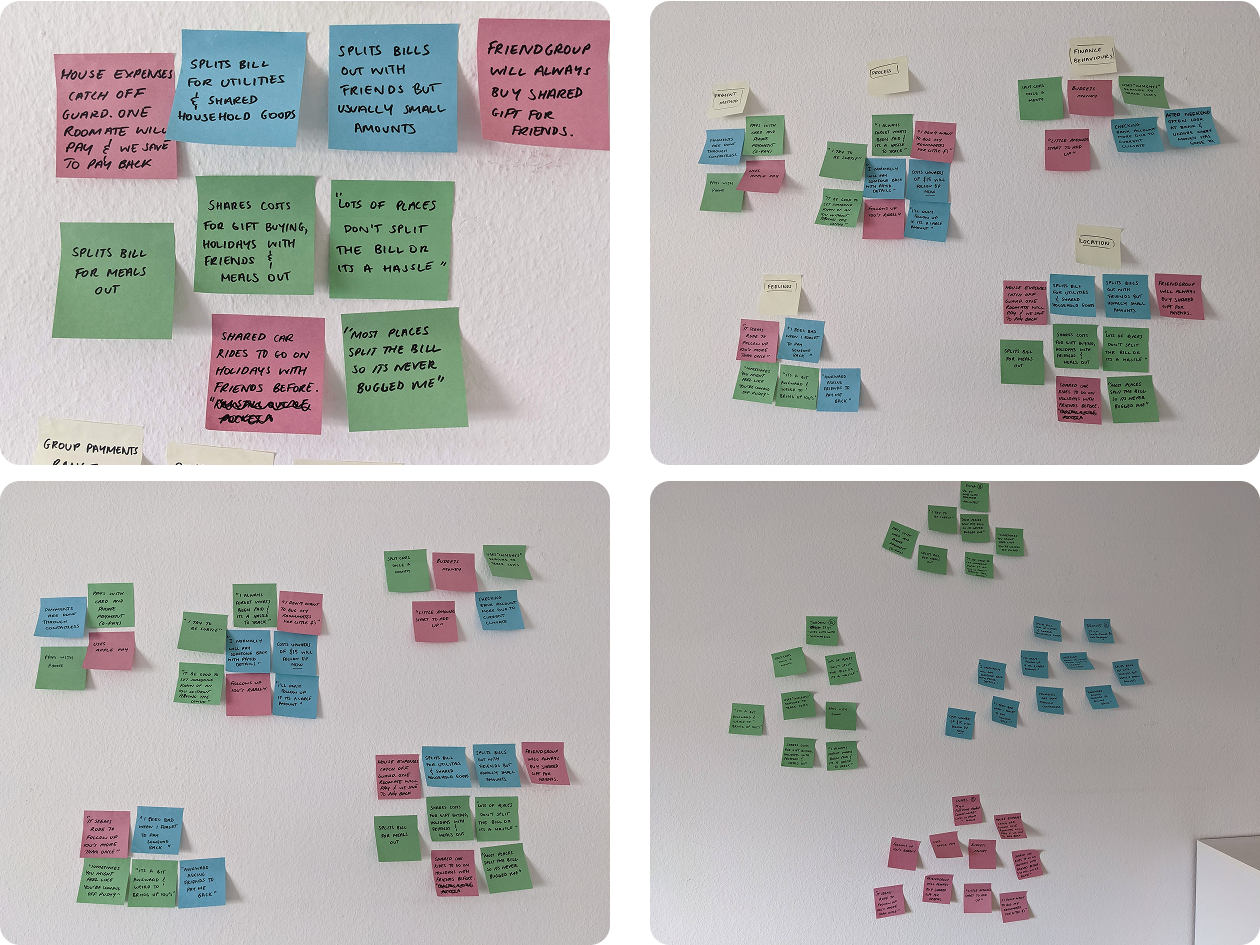
User Interviews
From user interviews I collected 11 insights, with 5 main themes
Personas
I was able to clearly identify that gaps exist in informal debt management and that my app would need to make sharing funds as seamless as possible to fill that gap. I put faces to the users and that helped me ground myself in understanding where the real-world problems might spring up.
See Personas
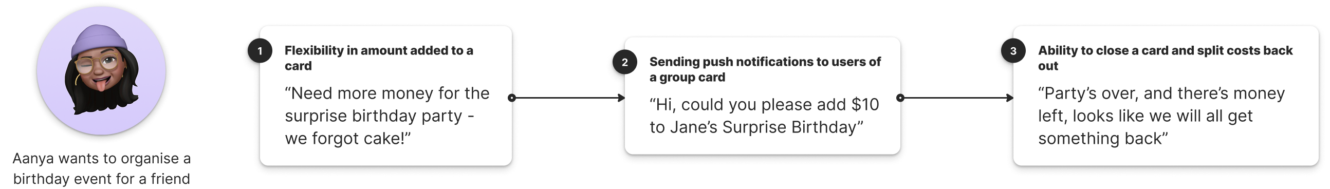
User Journey
This led me to looking at what a scenario where my app could be implemented and how. My interviews had told me that younger people shared costs often out and about and at home, and so through Aanya I found that multiple options for intervention existed...
Ideate
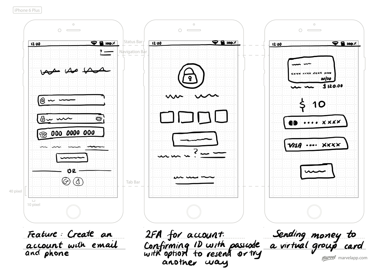
Sketching
After finalising the general architecture by creating the site map, I moved on to sketching ideas for the main user flows.
Test
Identifying Problems in the Design
I held the testing by screen sharing and allowing access so that we could both see the prototype - making the process a little more seamless.
I kept the conversation casual and asked my users to go through my major flows:
- Signing up
- Creating a card
- Topping up a card
Results
Main Takeaway
After all my tests were completed I took some time to step back, listen to the results and start to categorise errors .
Iterate
Collaboration with Peers
After working through errors I started iteration on designs with the help from feedback from peers who were also students of the Career Foundry Program. I was looking for feedback on, mainly feedback on the home screen as it had left me stumped after user testing. I also sought feedback for topping up a card, and creating a card. The feedback is finalised below:
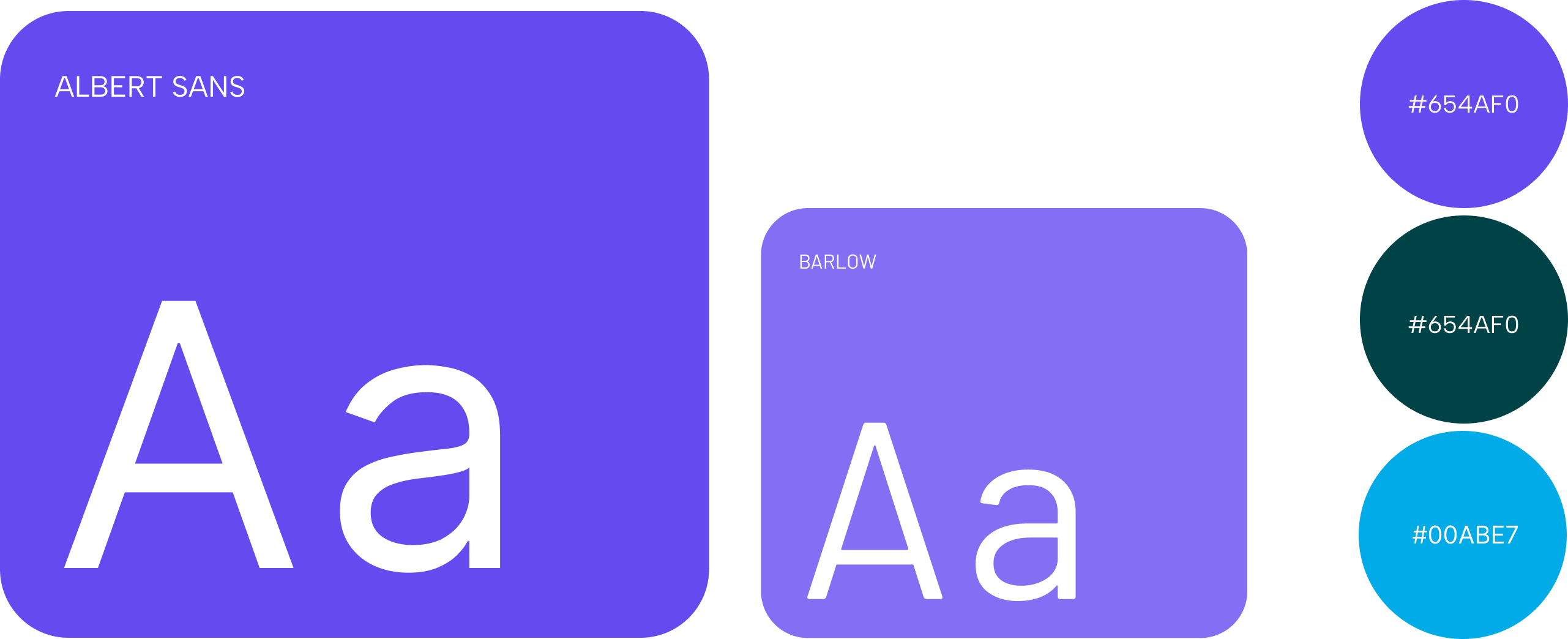
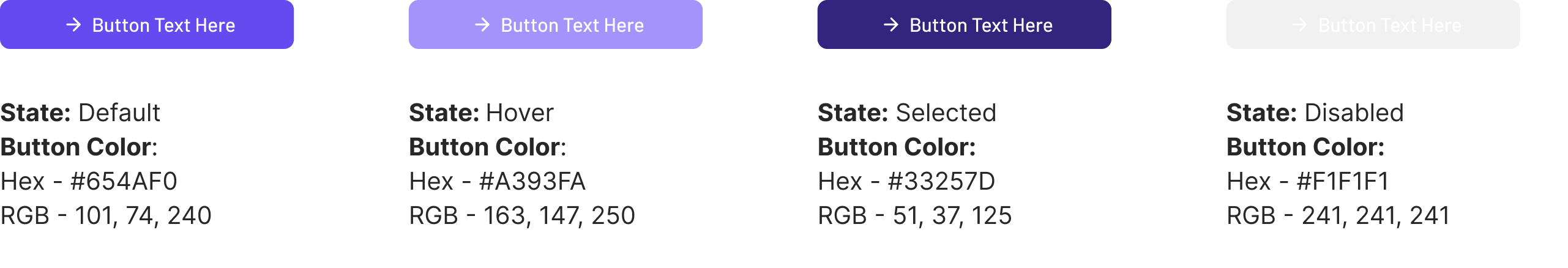
Style Guide
As my design progressed I worked on creating my style guide. I focused on choosing bright, vibrant colours. I checked each component to make sure they met accessibility guidelines as per WCAG.
The Finished Product
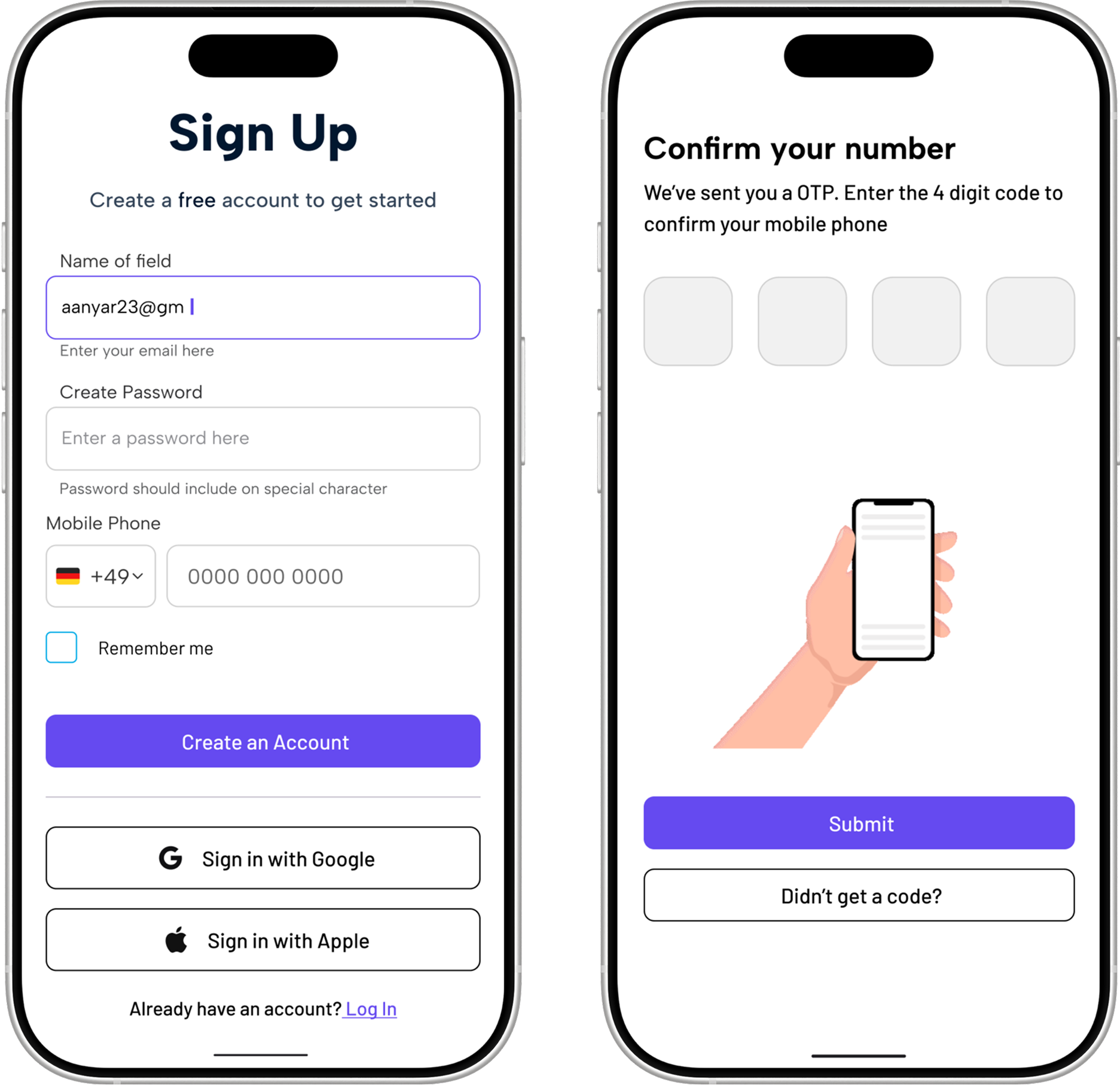
1. Account Creation
- Creating an account can be done through email, or through social link such as Google or Apple accounts.
- Users are able to input their fingerprint for a faster, and also more secure log in to their account.
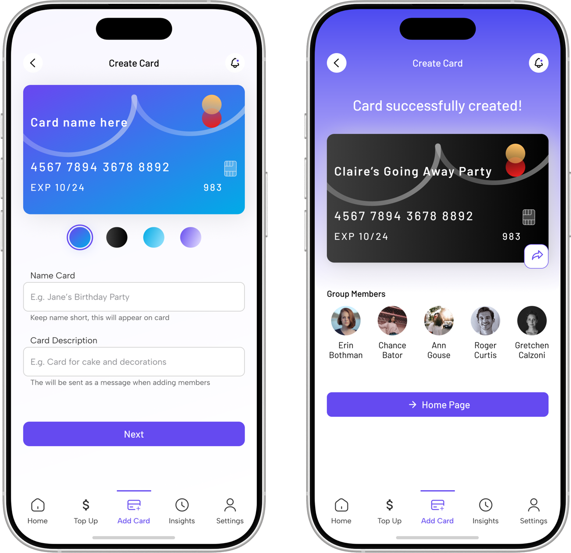
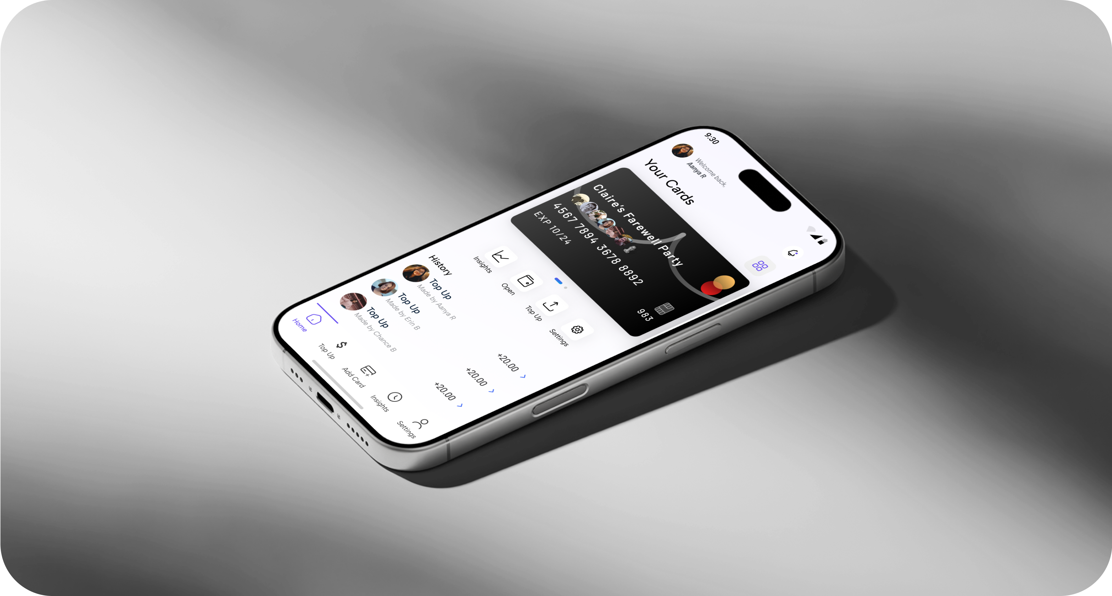
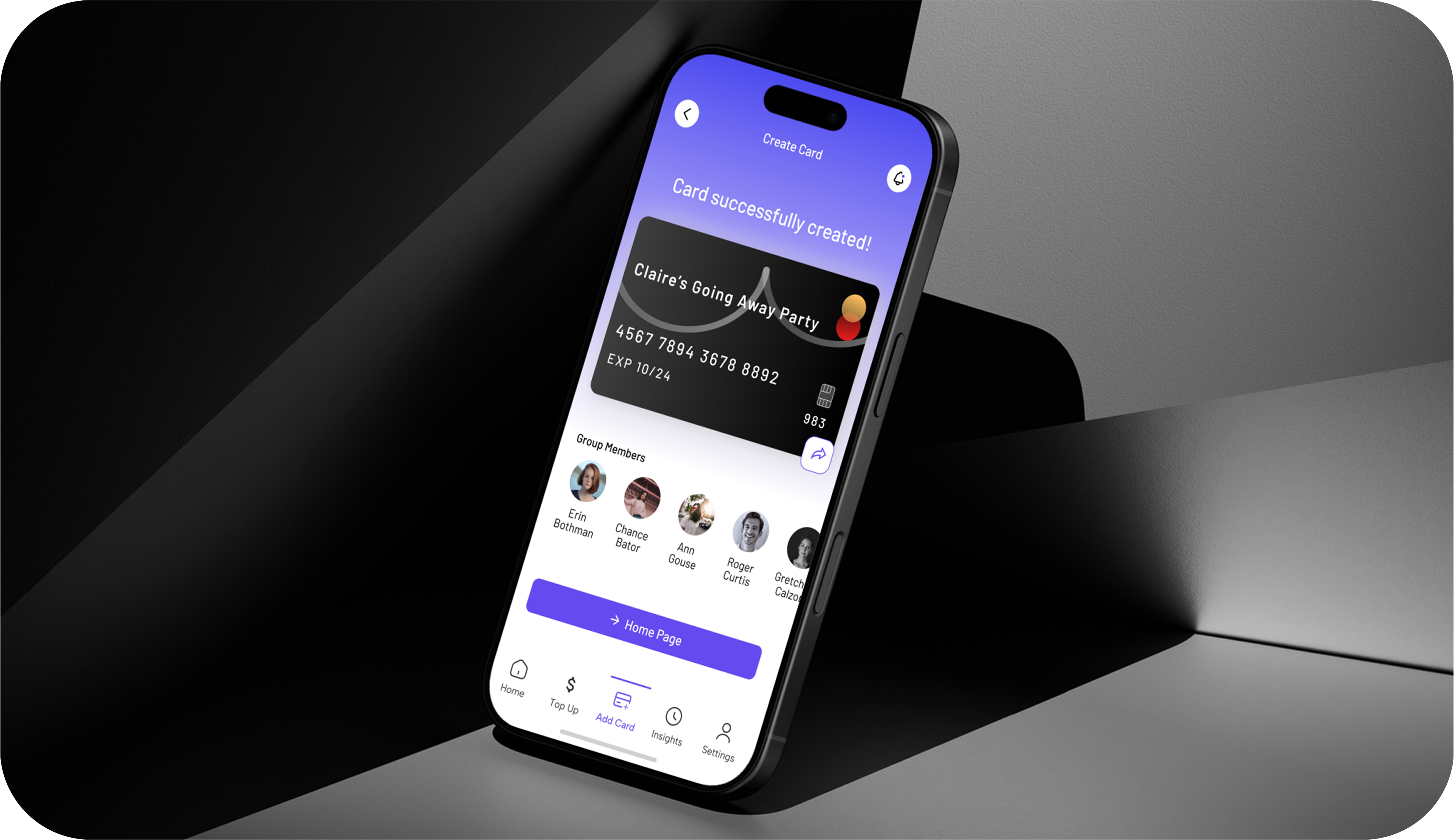
2. Creating a Card
Creating a group card is as easy as inviting other group members via email link or by copying a link to send to them.
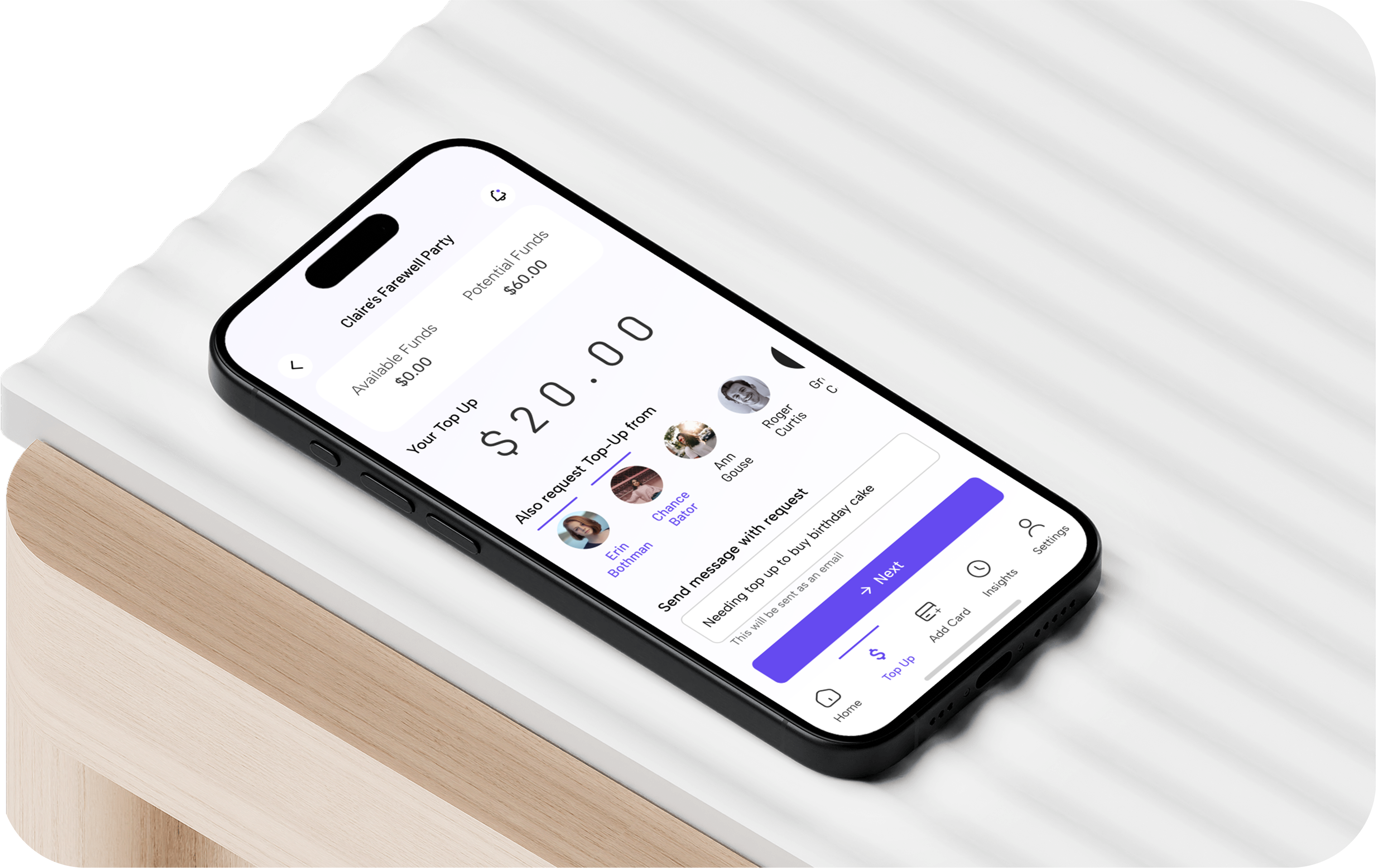
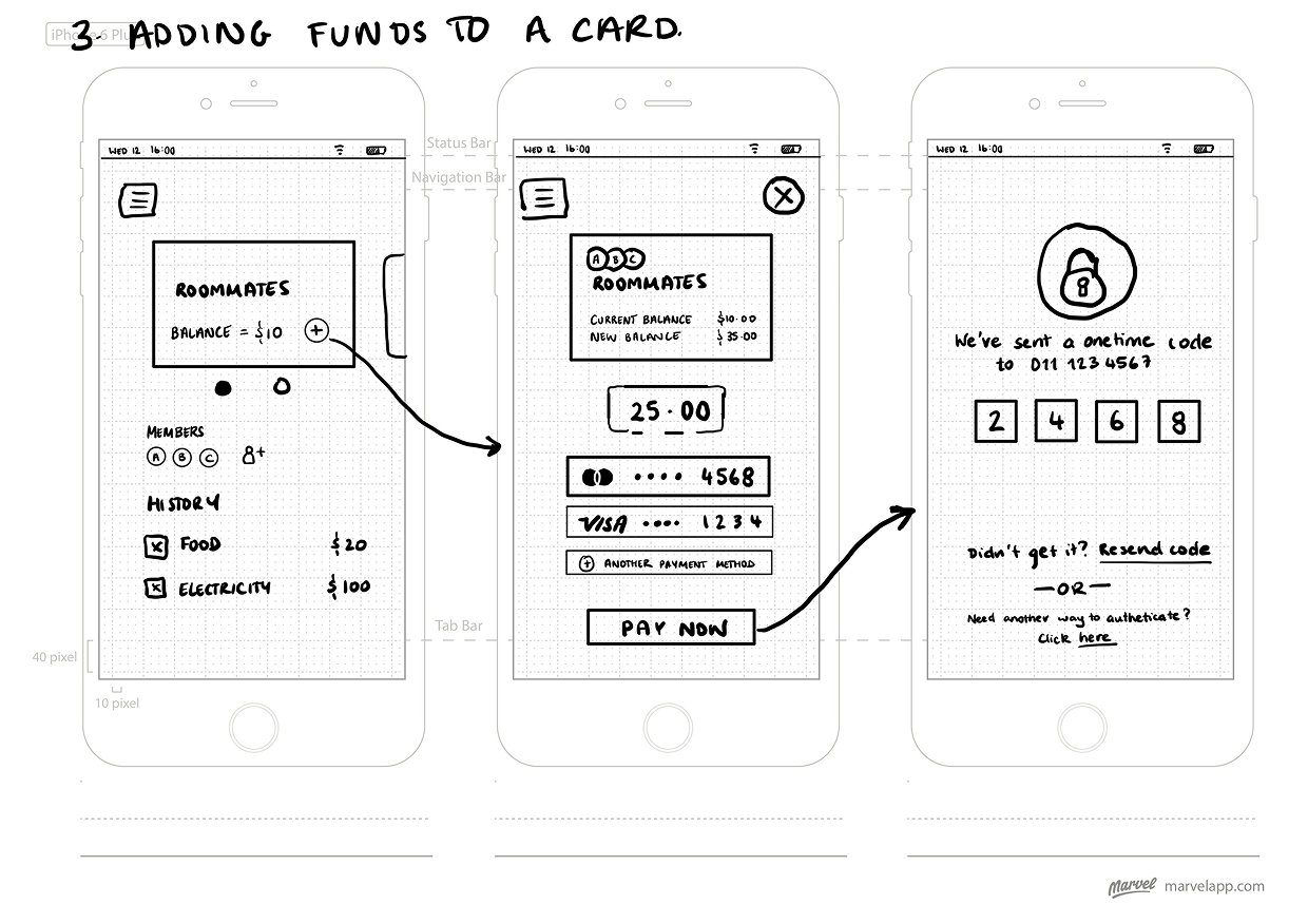
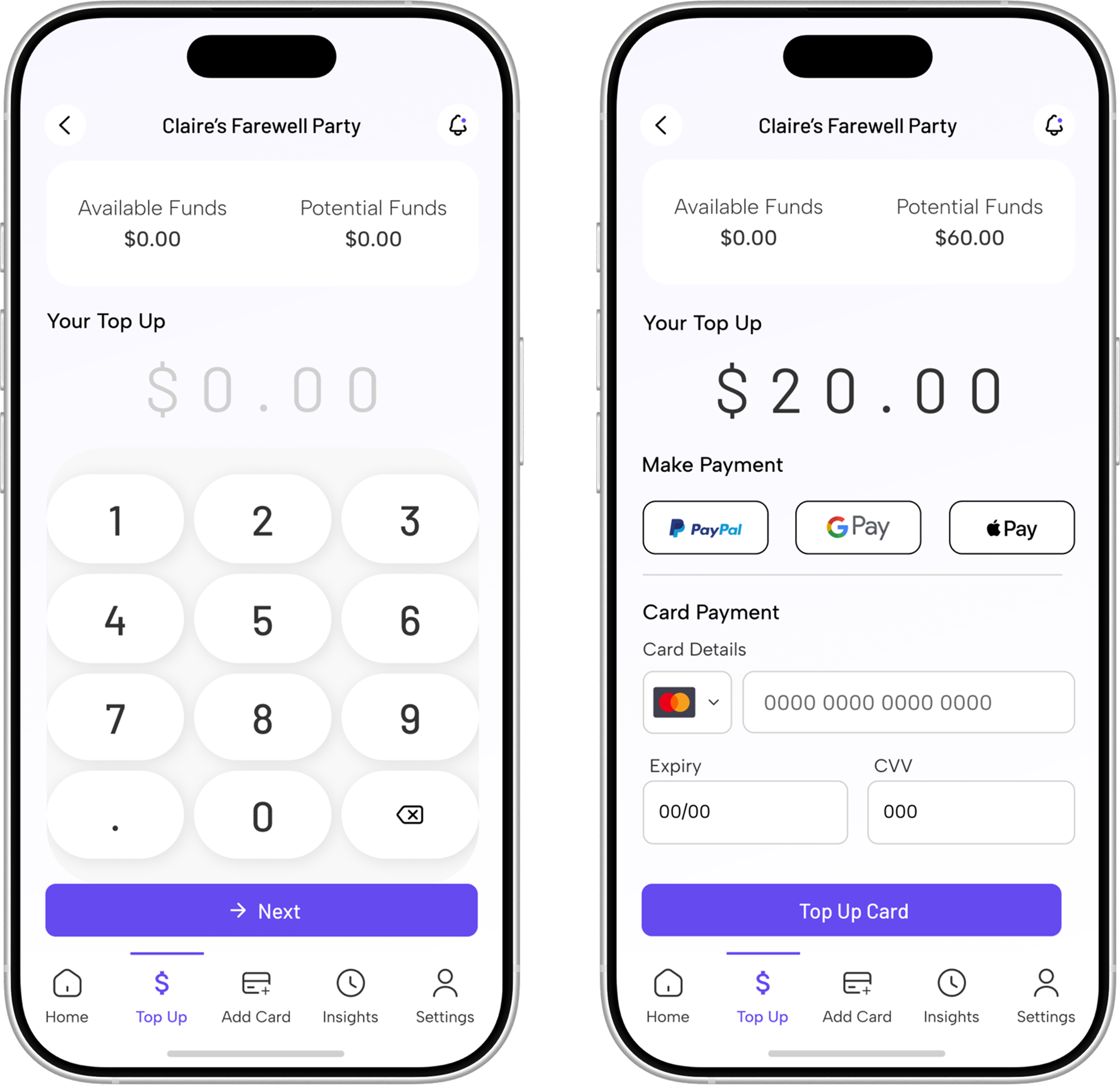
3. Adding Funds to a Card
Adding funds to a card is done by payment with a user's own debit/credit card. Users can request other group members to top up the card with same amount.
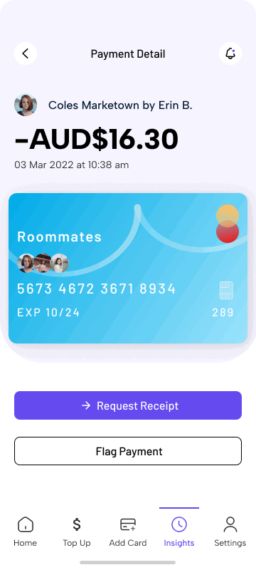
4. Financial Insights
Creating a group card is as easy as inviting other group members via email link or by copying a link to send to them.
Evaluate
The lesson I learnt was to get too caught up on one idea and test early and often. This was especially true with my home screen as after testing.
In the future I would like to to work on what the mechanism linking the card with Google or Apple pay may look like.